
Last week we covered how people absorb and retain information from your presentation. Today, we’ll explore all the actual guts of a good presentation. We’ll learn what really makes your presentation tick, and actually make it stick to your audience.

This is part 2 of 3. Click here to go back to the first part.
We have covered how people absorb, process and hopefully retain information that you have presented to them in your (what else?) presentation. Today we’re gonna cover what makes a good presentation. The essence of what makes a good storybook constant page-turner, and a good movie a box-office hit. We’re gonna share with you the secret of the core components of a good presentation.

There are basically only two components to remember here, so this should be an easy one, right?… Well, not exactly… Remembering these components are easy, but putting them into the context of your presentation may take a little effort on your part.
Component 1 – Contents Of A Good Story
What is more representative to a good story than a typical Hollywood blockbuster? And why are they so successful? The answer is very simple, each successful movie adhere strictly to a very simple formula. There are four, and only four ingredients that make up a good story. Nothing more, nothing less.
Just like a good Hollywood movie, your presentation is also a process of telling a story too – your story. And no, cramming your slides full of graphs and charts isn’t going to make your story any more interesting than it already is. So what are the ingredients that make up a good story?
(1) Hero
That’s right, every good Hollywood movie tells the story of a protagonist, a hero. In fact, I have yet to encounter any good movie that doesn’t depict a hero, whether a superhero or just a regular guy, who’s the underdog of the world that he’s living in, until he rises up to become the hero before the end of story.
And just like the storyline of a good Hollywood movie, your presentation is also telling a story of a protagonist too. So determine who or what is your hero, and build up the story surrounding this hero.
(2) Heroine
In order to make the Hollywood hero appear more human, they always depict a love interest; whether a forbidden love, a childhood sweetheart, or even an unexpected love.
Same as for your presentation, you also need to humanise your protagonist with a love-interest too. Or at least a secondary character that will support your protagonist. Your audience will be able to relate more with a warm and emotional storyline than one with nothing but cold hard facts.
(3) Villain
A hero isn’t a hero if he isn’t fighting a villain. That’s right, the next important content that makes a good story is when good fights evil, and good eventually triumphs over evil. A good story also needs an antagonist.
Apply this into your presentation. Your protagonist may be a person, a brand, a product, or even a service. What is the function of your protagonist? What does it do? And then ramp it up by introducing your antagonist. How does your hero “fight” against the injustice, or against the “evil empire” of the villain.
A good storyline will have a good balance of the relationship between the hero and the heroine, and between the hero and the villain.
(4) Showdown of Hero Vs Villain
What’s good of a villain if there’s no showdown between the hero and the villain? So the final ingredient of a good story is the final “fight-scene”.
Back to your presentation, your protagonist can be a person, brand, product, or a service. What is the “threat” that your antagonist poses to your protagonist? How does the final “showdown” play out? Can you make the final fight dramatic and exciting? How to show that your protagonist triumphs over the antagonist at the end of your storyline?
So with all these four important ingredients, you’ll be able to come out with a very interesting, exciting, and have your audience gripping at the edge of their seats while your tell your story on stage.
Component 2 – Stories That Relate
If you follow the above formula,and incorporate all of the above four ingredients, you’ll be able to come out with a good story. But it’s only a good story to you, and all those that can relate directly to your storyline. What about others that don’t relate to you and your storyline? In order to touch every single heart in the audience, you’ll have to tailor-make your story so that it touches every one of them. What you need is to design a story that relate to your audience.
Let’s take an example, the topic of Global Warming. This is one topic that is highly discussed, and will potentially affect everybody, whether directly or indirectly. The problem is that while it affects everybody, not everybody will feel the heat (pun intended). Many will still feel that it’s a problem for others, and will not touch them in anyway.
(1) Tabulate All The Data
Historically, the most accurate way to show the effect is the quantitative method, i.e. to accurately tabulate down the actual recording of the temperatures, like below :-
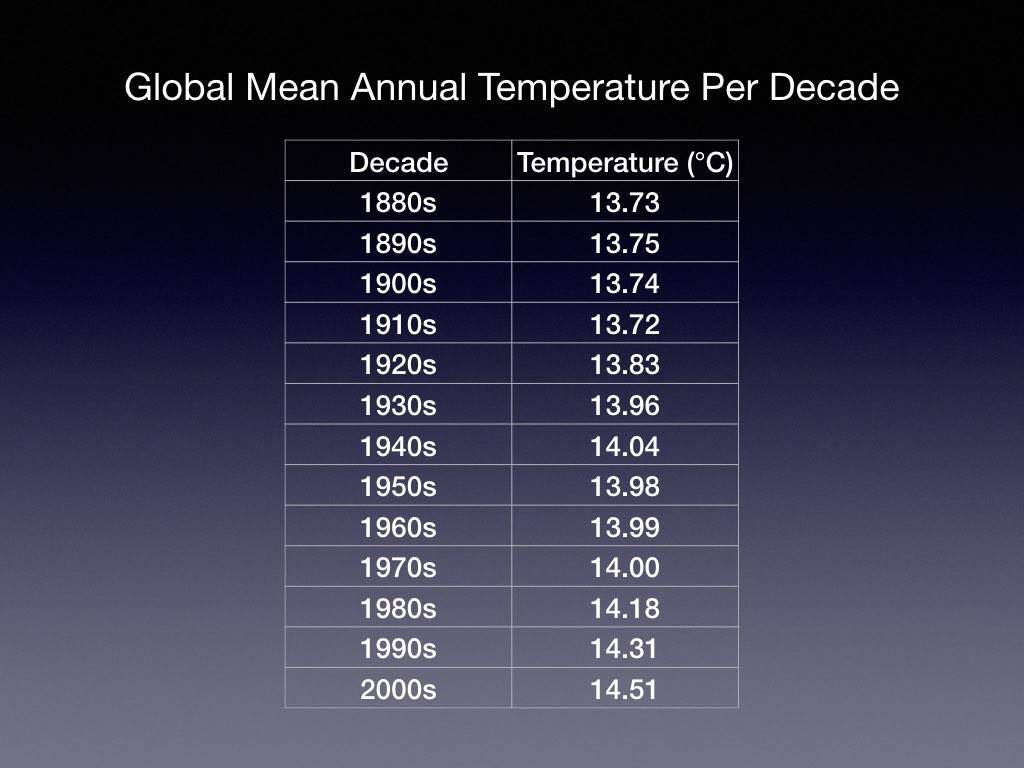
Please do take note that these values are the REAL values. Now, there’s no dispute that these values are accurate, and is the real indication of the topic – Global Warming. But the problem is that these numbers may not “touch” the heart of the audience. So how do you put down the quantitative representation of the table into something that is easier for the audience to digest?
(2) Make A Graphical Representation Of The Tabled Data
Well, most presentation trainers will tell you that graphics convey messages much faster and effective than a whole lot of numbers, neatly arranged in tiny little boxes, like the table above. So the solution is to draw a graph like this :-  Ahh… Now you can see much better… The values are accurate, and presented in a way that is easy to compare against the value before and after itself. I’m sure you must be thinking that this is the best way to present how Global Warming will affect all of us, right? So is there a better way?… Surely not, right?
Except that there still is a much better way, a sure-win way to guarantee the message is conveyed across properly, and will be retained much longer than merely displaying the tables and graphs.
(3) Make Your Message Mean Something To The Audience
While this example may not be the most accurate (quantitively at least), it will give a sense of relation to the audience. And most important of all, it’s guaranteed to stick to their minds for the foreseeable future.

And that concludes the Core Components, the second secret of a good presentation. Make sure you come back for the final part next week.
Pingback: Secrets Of A Good Presentation (Part 1 of 3) - Solarex Imaging