The humble business card. Nobody pays much attention to it, at least not until you run out of it before your next planned business trip. The business card is, without doubt, the most effective weapon in a business person’s arsenal. But what actually determines how good the business card’s design really is?

Makings Of An Effective Business Card
Today, I’m going to be talking about the design of the business card, not how you use it. For a business card to be effective, it has to convey all the important information across to the receiver. And more importantly, it has to be attractive and exciting enough to hold the attention of the reader. No point having all of your important contact information there, but boring enough not to warrant a second look.
With that in mind, it comes as no surprise that the humble business card has become today’s most important piece of real estate in the world. That teeny-tiny little piece of paper (or whatever material you may choose) is so small, that putting all of your business and contact information on it is virtually impossible. And we haven’t even talked about including pretty images to go along with the boring texts yet. So how do you put in all the important information, without cramming in too much information, or making the font size too small to read?
A Typical Looking Business Card Design

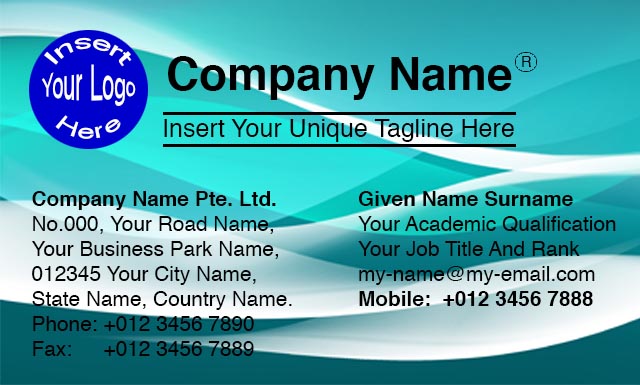
This is as typical as it gets. All the relevant and important information is printed right there on the card. And we’re not even including in some of the certifications your company got, or a description of what your company specialises in. It is, in effect, as bare-bones as you can get. And yet, it still looks pretty cramped, without much white background space.
And what if you want to insert in an image, or maybe some sort of graphic design into your card? Well, it’ll probably end up looking like this:

Looks pretty attract at a passing glance. But now your important bits of information (the text) has been obscured by the background. Some of the text actually blends themselves into the background, making it really difficult to read.
So how do you go about “raising” the important bits, making it more legible? Well, you can try to put a contrasting stroke around the text, separating the text itself from the background.
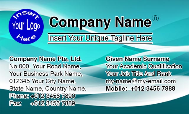
Using the same example as the one above, we would have ended up with a design like this:

Nah!… It looks like somebody tried too hard, and it still doesn’t look much better than the earlier version.
So How Do You Design It Without Trying Too Hard?
First and foremost, here are some key points to pay attention to:
(1) Corporate Logo And Company Name Is Important
The identity and the brand of the company is the single most important piece of information that you can put on a business card. So make it as “loud” and as visible as possible.
(2) The Name And Job Title Comes Next
Your business card announces your identity, and that hitches a ride on the company’s brand identity. So your name must also be prominently displayed. Some of you may choose to include your academic qualifications. But unless it’s relevant and really important for the job, like in an academic position, you may want to leave that out. Let it be a conversation piece for you to expand on personally after the pleasantries of exchanging business cards during a first meeting.
And you might want to consider capitalising your surname/patriarch name too. It’ll cut down on the unnecessary misunderstandings that might happen when you communicate cross-culture. Read this article to get a more in-depth understanding of the differences in cultural naming conventions.
(3) Cut Down On The Amount Of Text
This is gonna be a little difficult, especially if you have a pretty long address. Perhaps you could try to cut down the number of lines by doubling up on the address?
Remove all the obvious words like “Tel. No.“, “Fax No.“, “Mobile No.” “Email“, “Website“, etc. Once you put in the actual content, the format itself will already tell the reader what it is.
(4) Fax Number… Seriously?…
It’s no longer 1995, when inter-companies’ communications still necessitate the use of facsimile machines to send documents. In today’s world, more and more workers are taking their work away from their physical offices. Some may choose to work from the comfort of their own home, while others prefer to work at their local café, soaking in the environment, while sipping their favourite caffè latte.
Besides, sending documents via email is more efficient, not to mention much clearer too. And everybody have their personal email account anyway, so you can actually send the document directly to the recipient. Much more personalised than to send an open document to a common receiver, and then only addressing the recipient by his/her name on the header. There goes the confidentiality out the window…
(5) It’s All About Achieving Balance
Too much logo and text?… No good… Too much empty space?… No good… What you should strive to achieve is a balance between information (texts) and empty spaces.
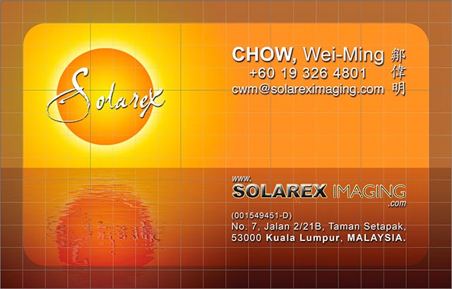
Let’s take my personal business card as an example:

Notice how the important sets of information are segregated, and neatly arranged in their own little boxes? And make sure you align these little boxes too. Believe me, even without the guidelines, the human eye can still perceive whether they’re out of alignment or not.
Also notice how I subconsciously divide the whole card into quadrants? Each quadrant houses their own little bit of detail, whether information boxes, or graphics. With all four quadrants equally filled up, you will then have achieved balance.
(6) Allow Space For The Cutting Process
While we can design the business card pretty accurately just by looking at a single card, most people tend to forget that they’ll ultimately be printed on large sheets of medium, before undergoing the knife. And during that process, there’ll always be the possibility that your perfectly aligned card will be cut slightly shorter than expected. This is what printers refer to as the “crop margin”.
Printers will always request for a minimum 3mm overprint for the crop margin, to allow for the spacing error during the cutting process. Me personally, I prefer to allow 5mm of overprint. Better to err on the side of caution.

This is what the finished design actually looks like, with the crop margin darkened for the ease of viewing. Of course, in the actual design, I don’t have the darkened area at all.

As you can see from this close-up, the crop margin is a safe 5mm from the actual edge of the design.
Attributes Of A Good Design
With a well-designed business card, you’re armed with your most effective weapon to wage battle in the business world. A well-balanced and neatly designed business card, complete with all the necessary information, reflects positively on how you run your business. If they like what they see being reflected on your business card, the chances are that they they’ll also look positively to doing business with you.
